Street Wise: How Two Designers Created a New York-Inspired Typeface
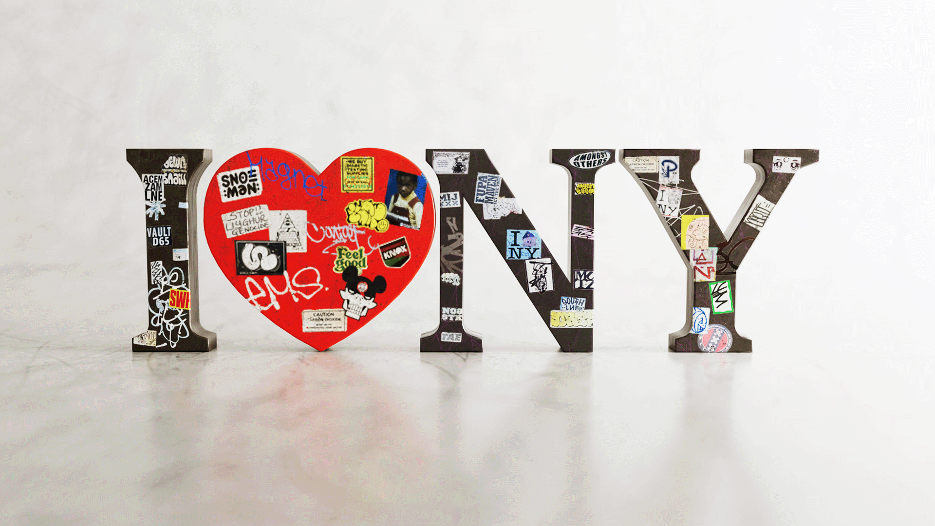
I Love New York composed of Streetwise 3D by Barbara Cadorna and Alex Severino.
In this time-scarce era, the new normal is racing the clock to get through the workday while scrounging to find time for other pursuits. For creative people, however, there is value in tackling projects outside of client work. These allow you to explore ideas that matter to you, stretch your talents further, and build an exciting portfolio.
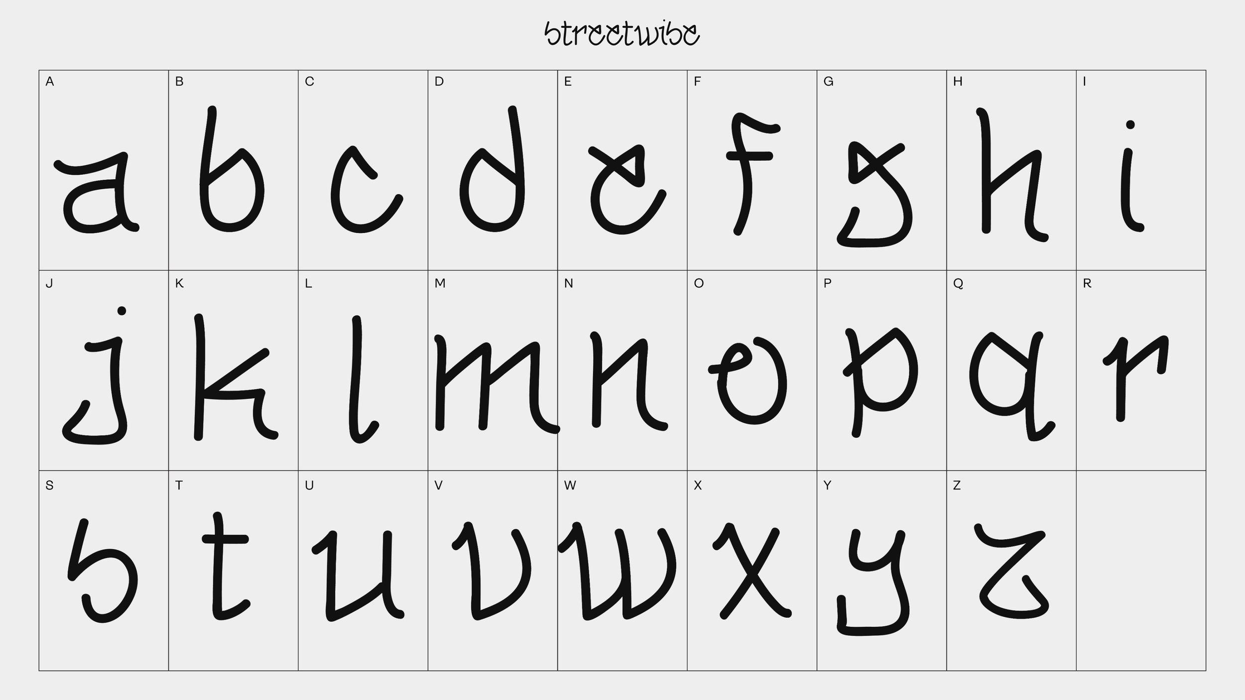
Over the span of two months, Coalesce Creative Director Alex Severino and Designer Barbara Cadorna worked nights and weekends to create a custom typeface design that has New York written all over it. It was part of 36 Days of Type, and the personal project allowed them to express their unique interpretation of the Latin alphabet. (As their colleagues, we might be biased, but we love the hand-styled Serif font.)
Alex’s childhood was largely spent skateboarding on the streets of Long Island, New York where he developed an appreciation for the edgy approach of graffiti artwork. Barbara first found her love of mixed media in her native Rio, Brazil. Between the two of them, they had plenty of great ideas for what became the Street Wise typeface: a manhole cover design, VHS shoots around the city, animations featuring the Subway, or photoshops of their typeface onto art at the MoMa. For an added twist, Barbara took on the role of Creative Director, effectively becoming her boss’ boss, while Alex designed the letters and dove headfirst into Cinema 4D software.
Here, they explain why they looked to New York for their typeface inspiration, the importance of making time outside of work to pursue personal projects, and the funny story behind the name Street Wise.

Tell me about the Street Wise project. How did you decide to do it together?
AS: There’s a social media project once a year called 36 Days of Type that started 10 years ago when I was in design school. The duration of the project is 36 days, and you share your custom designed letter on social media every day. Each letter is its own piece of art. A lot of designers have launched their careers off of this project and it has consistently gotten bigger every year. I’ve always wanted to do it but have always been too busy. Since Barbara was interested though I thought it would be cool for us to team up and get it done.
BC: It’s a pretty dense project. I’ve wanted to be part of it, but I’ve been hesitant because I always have so much work to do. It was great that Alex had the idea to do it together and make it doable. We split up the production work, with me creating the composite and sticker placements on the letters and him using Cinema 4D to create frames for me to make the videos in After Effect.
How does your shared appreciation of New York’s artwork show up in the typeface?
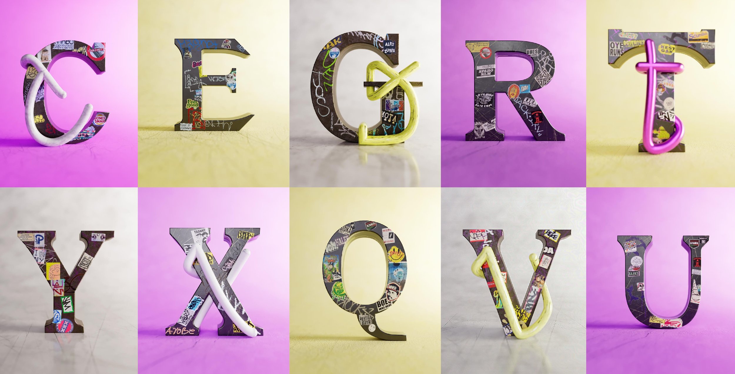
AS: The idea was that we marry the institutions of New York City with the street culture, and communicate that in the most basic form, which is the composite. During those 36 days, we wanted to elevate the art of our Serif font to the next level by building out the city environment on it. The Serif letters were inspired by the architecture of New York, so I gave them a very strong footing: very architectonic, structural, sharp, and ambitious, like a heavy bull. Then we added layers, like putting stickers from the city onto the letters, to build out that environment and hopefully deliver the message in a more clear or impactful way. Finally, we added sounds from the city into the videos to hopefully transport the viewer into the scene.
By the end of that process, did the font represent New York through your eyes?
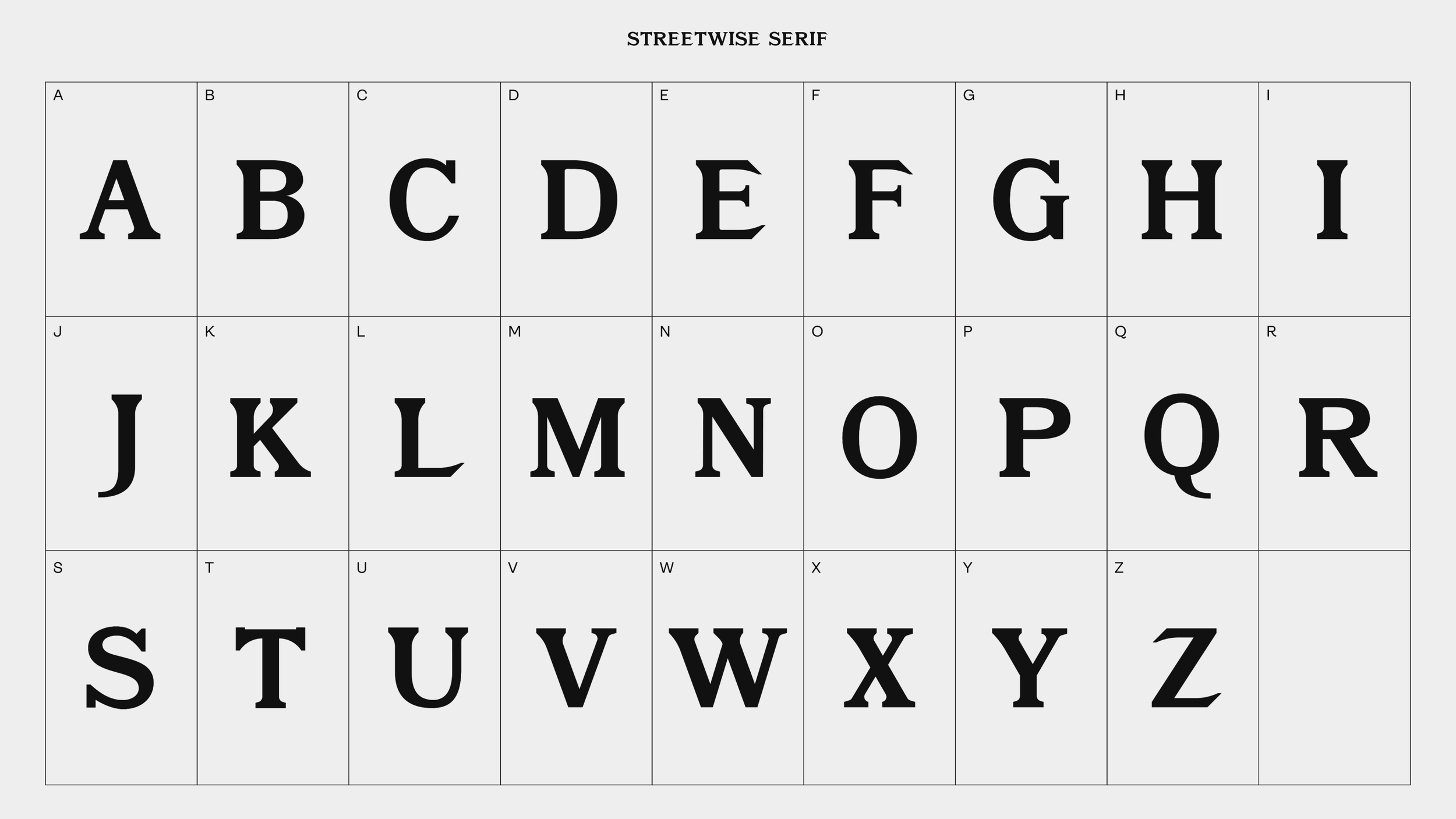
AS: The best way to see whether the typeface represented the institutions of New York was to test if it felt appropriate with iconic New York titles, labels, or logos. Ideally, the look would feel like what the Empire State Building might choose for its logo. I was messing around and using our letters to spell out phrases like the New Yorker or the New York Times. I even created license plates with the font. I asked myself, would it be a reach? If the New York license plates used this font, would it work? It had to feel like it was part of the street culture of New York. At first I liked the initial handstyle that I drew, which was expressive, friendly and energetic. But we went with a different handstyle, which was influenced by the sharp angles and characteristics of the Serif font. That one grew on me because it’s similar to how street culture is highly influenced, right or wrong, better and worse, by the institutions.
BC: I believe the font is really appropriate for New York, and the Serif font nailed the tone of the city’s institutions. As a Brazilian girl, it feels intimidating to think about New York and institutions like the Empire State Building, or to imagine working at the New Yorker. The font needed to live up to that intimidation. I always look at the “E” and it's so bold and it feels like that letter is about to fight me, so it works.
Why did you name it Street Wise?
BC: There’s a story behind that. I was defining the tone for the project, saying to Alex, “I want it to be casual, active, and street wise.” I meant to say “street smart” but it was a slip of tongue. Then we decided, “Yeah, that’s actually really dope.”
New York City represents more than eight million people with different backgrounds. How does your typeface express the culture of such a diverse city?
AS: People have radically different experiences in the city. If you’re an investment banker, your experience is different from someone who is a garbage person. And when people think of the city, most people who didn’t grow up here have one picture of it in their mind; either the Empire State Building, or the Statue of Liberty, or the streets of Harlem. In this project, we tried to express the more rigid institutions of New York and their edgy, rough tones with the city’s more fluid street culture. What I mean is that the working culture of Manhattan has to adapt and evolve with its institutions. And to me, the most interesting designs are the ones that combine two contrasting ideas or tones like this one does.
How did your backgrounds inform the design you came up with?
BC: My inspiration largely came from my background growing up in Brazil. I grew up in Rio, where there is a bunch of street art around, and I’ve always been interested in graffiti lettering and mixed media, like combining painting with digital art. In college, I came to see that I could create unique things when I’m combining art and design. I fell in love with that sweet spot, the intersection of the two.
I did a project in college called “Neighborhood Guide” where I described my neighborhood through typography in a book format. I chose typography as my category because of the multitude of typographic cues in Bushwick, where I’m based: From the excessive use of Helvetica and Cooper Black on store signs, to graffiti tags, to announcement fliers filling up light posts and mailboxes. The project taught me a lot about graffiti arts, since I had no clue at the time that there are so many subcategories in graffiti. There’s an entire hierarchy of respect in the art form. For example, you could never place a “tag” on a “throw-up” because of its complexity and time investment. So the art I had explored in my neighborhood for that project ended up inspiring our typeface for the 36 Days project, at least subconsciously. And some stickers on our letters came right from those archives.
AS: We are both New Yorkers now, and what we see around us impacted the design we came up with. I’m kind of a skater kid, I grew up on Long Island and I’ve lived in Harlem for the past 10 years. As a street person of sorts, I’ve always been inspired by graffiti, whether it’s the texture or the edgy approach to the process, and I let that inform this design.
What do you plan to do with your typeface, whether you decide to let others use it or not?
BC: We want to make it available for people to use. We were thinking about creating a website and selling merchandise, and stickers, obviously.
AS: One of the main goals was to build a brand, Street Wise, and the first step was the typeface. Now we need to make a landing page where people can purchase the font and make merchandise with it. Or maybe we will take it in a different direction one day, when we have the time — when we find the time.
Speaking of, both of you have day jobs, yet you made time for a passion project that was adjacent to what you do during the work day. Why was it important to find time to pursue the challenge?
AS: There is time. People have time to do things, but it has to replace something else, like watching “Friends” on your couch for a few hours or maybe even having a social life. Finding time is a challenge every designer faces. A lot of my favorite designers are known most for their personal work. Meaning, what elevated them to reach a certain artistic level wasn’t necessarily the client project they did for Gucci — it was the weird side project they did that got them the client work for Gucci. It’s hard to sell a client on something you’ve never done before.
It’s up to designers to make the time for side projects and build a portfolio that extends beyond what they do for their work. Take Virgo Abloh, who founded Off White, a streetwear brand. He had been an established, high-end designer for more than 10 years before he launched his brand. But when he started Off White, he said, “I never show people anything else. Off White is my portfolio.” Abloh took it upon himself to create the work that he wanted to get.
If you’d like to read more from Creative Factor, subscribe to our newsletter. Or looking to tell your brand story? Introducing Creative Factor’s Storytelling Studio.
Plus, more great reads right this way…