Jeremy Mickel: From Ohio to Typeface Stardom
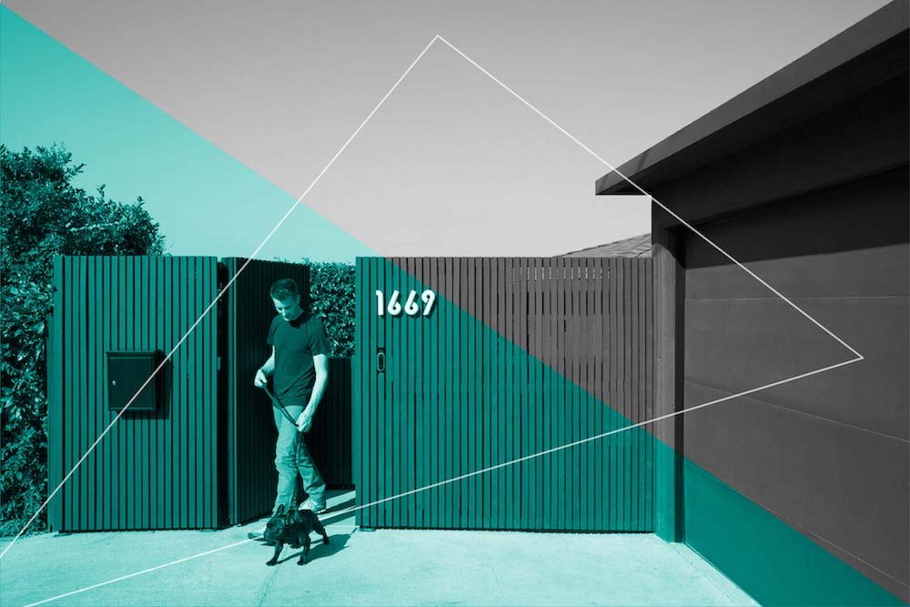
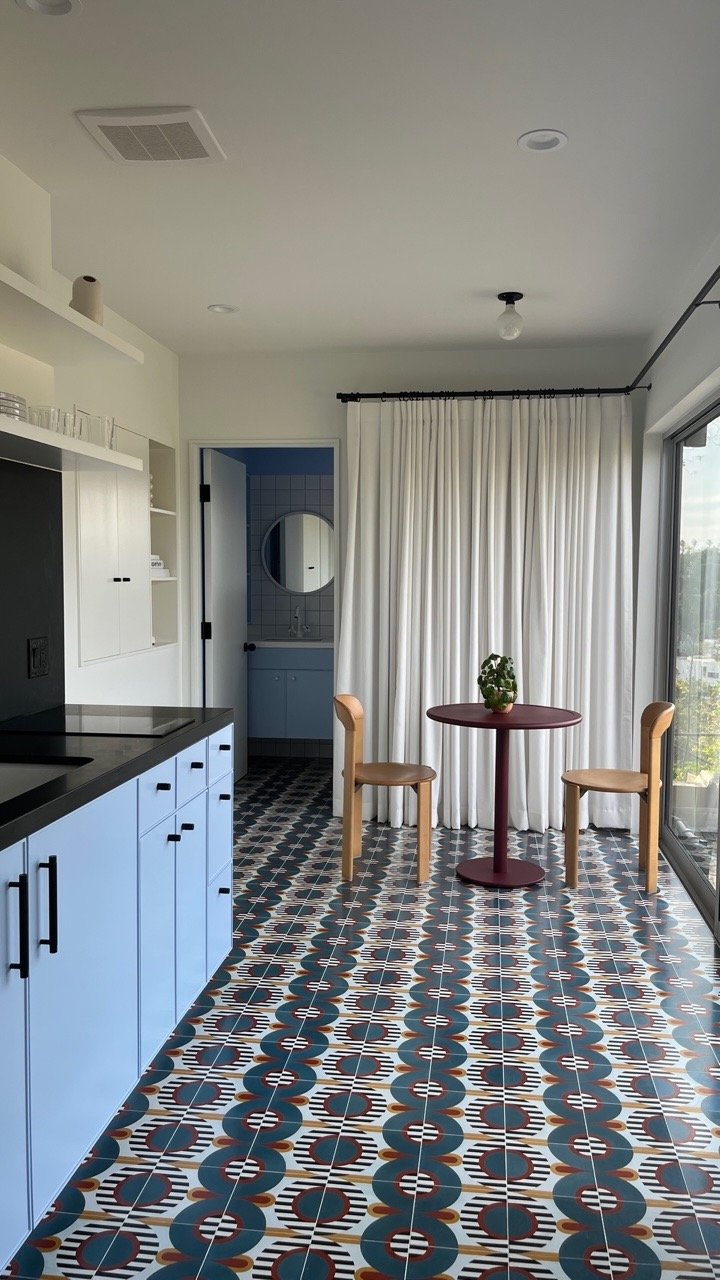
Even the typeface on Jeremy Mickel’s home is on point. Images: c/o Jeremy Mickel
Jeremy Mickel, founder of MCKL, the L.A.-based design studio and type foundry, might have the fastest commute in the city. It’s on the ground floor of his Silver Lake house. The defining characteristic is the blue, red, and white tiles by Concrete Collaborative, to say nothing of the modern kitchenette and home gym that is discreetly hidden behind a curtain during video calls. They all arrived as part of a recent renovation by And And And Studio, making it an ideal spot to live, work, and play.
There, Mickel tackles his latest projects for some of the more compelling brands in the world. His clients include the LA 2028 Olympics, Uber, Sweetgreen, MGM studios, Bon Appétit, and The Atlantic. Just don’t ask him to pick a favorite typeface. “My stock answer is whatever I’m currently finishing,” he says.
Mickel published his first typeface in 2008, then launched his business in 2012. “I found my niche focusing on custom typefaces and fostering relationships that have yielded these creative partnerships,” he says. “I’m also committed to publishing fonts for anyone to license.” Here, he takes us behind-the-scenes of his work for the LA 28 Olympics and Bon Appétit’s refreshed brand identity, shares where he gets his ideas, and discloses the typeface he is most excited about at the moment.
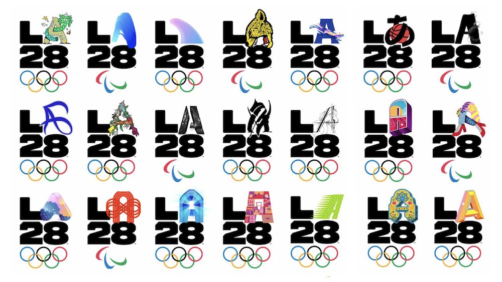
The LA 2028 typeface is influenced by the corners of the Hollywood sign.
The 2028 Olympics are still five years away, yet your work for them is already complete. How did that come to be?
I worked with the LA28 team here in Los Angeles, but was originally contacted by the Toronto-based design firm Public Address. Their creative director had seen some of my work and knew I was in L.A. When I took graphic design classes, we studied the 1968 Mexico City Olympics identity and so this was a dream project.
Are you nervous about more than a billion people seeing your work?
This started in 2019, and it’s for the 2028 Games, so we still have a ways to go. But I was intimidated to go to the office and see the torch from the 1984 Olympics. It is the biggest stage in the world, but when I created the typeface I was heads down focused on the brief at hand. I worked to depict something that represents the location, the times, and nations coming together and the pure spectacle of the sports competition. I thought about how I could depict all of those ideas in one cohesive design.
The octagonal letter forms, which don't have curves and have 45 degree diagonals in the corners, are synonymous with the Hollywood sign, as well as other Los Angeles references like the work of Ed Ruscha and signage from the 1932 LA Olympics. Sports jerseys have octagonal letter forms, so there is this convergence of that in the story we can tell. It’s always challenging to design for the future, especially when it’s eight years out. Hopefully it will age well!
Did you view this project differently than others?
Whether it’s a magazine or the Olympics, it's often the same challenge: How do you figure out what they're trying to communicate? What are the unique parameters of the way they're using this? And how can you do it in a timeframe and budget?
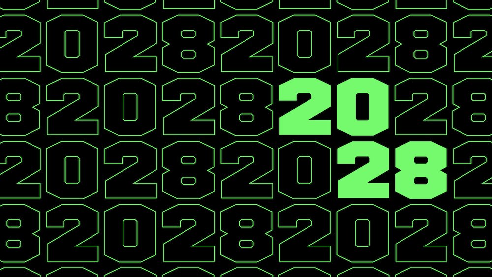
How long did it take you to create it?
It was actually a pretty quick sprint. I heard from them in August, and I delivered the work before the end of the year. So four months. It could grow as they are still figuring out what the full expression might be and whether they need any additional styles or language extensions.
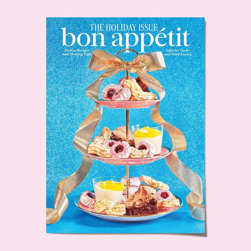
Mickel looked to 1960s cookbook nostalgia to bring Bon Appétit’s type into a new chapter.
Take us behind the scenes of your Bon Appétit typeface refresh.
It started with my work for The Atlantic in 2019. At the time, Arsh Raziuddin, who is the creative director at Bon Appétit, was an art director there. We didn’t interact directly on The Atlantic project, but she was aware of my work and when the time came for Bon Appétit to do something similar, she said I was the first person she thought of. The brief was for a logo update and a typeface they could use in the magazine as well as for brand marketing.
The logo is a subtle update, still a serif in lowercase, but we increased its elegance with higher contrast details like the curved accent over the “e”. By rounding the corners of the letters we evoked the 1960s and 1970s cookbook nostalgia that Arsh was referencing through photography styles. For the typeface, we developed a more condensed version of the font in roman and italic, which works great for headlines.

A very good night deserves a very good font.
You’re originally from Ohio. Did you ever think your career path would take you here?
Growing up I didn't know what graphic design was. I was always creative, so people would tell me I was an artist. But when I look back at what I was doing, I was really a designer–drawing was like breathing. Creativity just flowed out of me.
I went to Indiana University in Bloomington and studied fine arts. That was continuing on the path of finding my creative outlet. I was in a band, played guitar, wrote songs, and tried all these different things–and to be honest, none were the best fit. After graduating, I went to the University of Dayton, where my mom taught, to take some design classes. There I put together a graphic design portfolio. From doing that I got really excited about typography. Later, moving to New York and living in the city is where I had the idea to become a typeface designer.
What's your special sauce?
I focus on the story of the brand. I dig deep into the brand history and source material and that points you towards what the company is trying to communicate. That opens us to ideas, in ways that just drawing doesn’t. I get ideas from living in Los Angeles, especially from the signage I see. Over the years I noticed some hand-painted Helvetica signs when I walked around the reservoir and they inspired my new Owners typeface. I really like Americana. That’s largely because of where I grew up and where I live and the things that I see every day.

Mickel’s office is as beautiful as his typefaces.
What typeface are you excited about these days?
I believe there are few bad typefaces, there are just bad uses. I’m excited about an upcoming release we are working on called Trust. It’s inspired by the lettering on U.S. coins and takes on this 1970s phototype American vibe.
You have collaborated with iconic institutions and accomplished designers, such as Michael Beirut. What contributes to meaningful collaboration?
The best thing you can do if you're on a call with Michael Beirut is to listen. He knows what works for the client and knows the entire history of graphic design as well as everything that is happening right now. I’ve worked with him on a number of projects and he lets me do my own thing. He puts together the team he knows is going to get the job done.
Who is a dream client?
I would love to do an airline. Delta, if you’re listening, I can make it work.
If you’d like to read more from Creative Factor, subscribe to our newsletter. Or looking to tell your brand story? Introducing Creative Factor’s Storytelling Studio.
Plus, more great reads, right this way…