How to Use Data Without Killing Your Creative Instincts
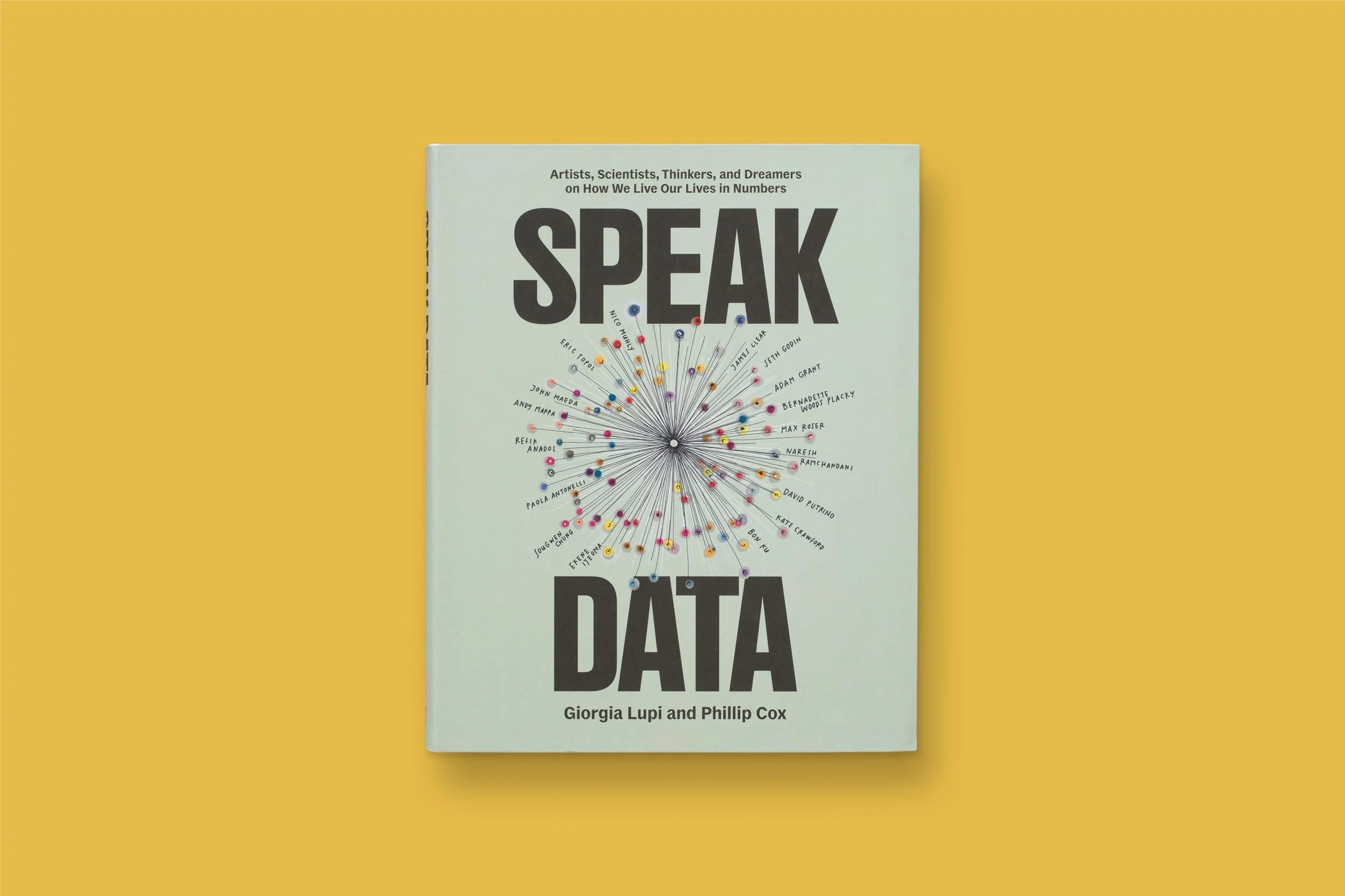
Speak Data makes the case that data is actually deeply human.
Data has a branding problem. For many creative people, it still feels cold, corporate, and faintly accusatory, like something you’re handed in a spreadsheet and told to “make insights from.” But Pentagram partner Giorgia Lupi and brand strategist Phillip Cox don’t see data that way at all.
In their new book Speak Data, they argue that data is deeply human: authored, biased, emotional, and full of creative possibility. What emerges is less a theory about data and more a usable creative practice.
Here, they share how designers can use data to translate numbers into meaning, unlock new ideas, and communicate more powerfully in their work.
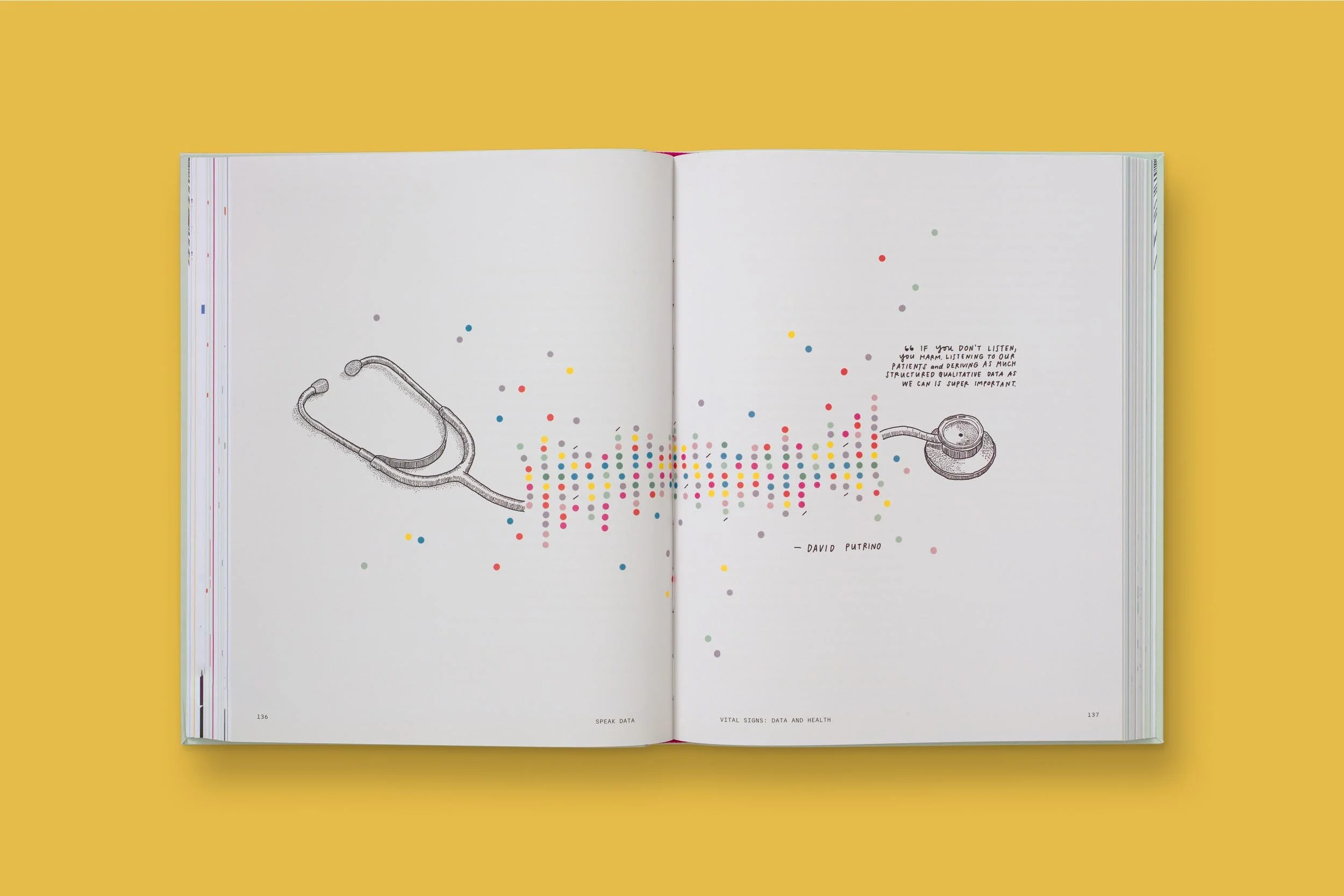
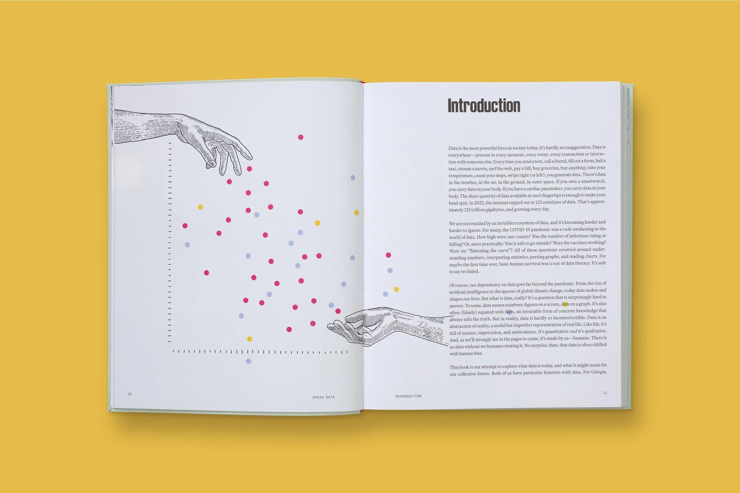
No, data doesn’t have to be limited to black and white graphs.
Your book takes on data — something many creative professionals feel disconnected from — and reframes it in a much more human, creative way. What do you want to convey with Speak Data?
GL: Even starting with the title, Speak Data, we wanted to demystify it. Data isn’t this cold, inhuman entity. It’s something we should all learn to engage with, whether or not we work with it every day. Data is everywhere: in our phones, in algorithms, in AI systems. If we learn to speak its language, we can make better decisions and develop a more critical understanding of the world. Data is human-made, and that’s central to our argument.
PC: A big part of this was reaching people who don’t think of data as part of their job or creative practice. Even within design, data visualization specialists are a small group. But today, no one can afford to be “data allergic.” Our thesis is twofold. First, we need to redefine what data actually is, which is something tangible and authored, not abstract and intimidating. Second, once you see that data is human-made, it becomes creative material, just like color, type, or form. The intersection of those things is where the real magic happens.

“Data is everywhere.... If we learn to speak its language, we can make better decisions and develop a more critical understanding of the world.”
— Giorgia Lupi
How can someone who doesn’t see themselves as “a data person” begin to see it as “creative material”?
PC: The core question of the book is, What is data for? We talk less about “data literacy” and more about “data fluency,” the holistic understanding of what data is, where it comes from, and what it can do. Creativity with data doesn’t have to mean charts and graphs. It can be poetic, gestural, and emotional. Once people realize that, the intimidation drops away.
GL: We asked all of our interviewees to define data, because even that act is revealing. Refik Anadol calls data a form of memory. Others describe it as another way of seeing, or as moments of drama in a story. When you start there, it becomes much more manageable and creative.

“People often feel trapped by a dataset, as if it can only say what’s already there.”
— Phillip Cox
One frustration people often have is that data feels disconnected from real human behavior. You see a number, but it doesn’t feel true or believable. How do you bridge that gap?
GL: This is where our idea of data humanism comes in. Every dataset has an author. Someone decided what to include, how to measure it, and what perspective to take. Accepting that subjectivity is part of humanizing data. Then, whenever we’re dealing with large or aggregated datasets, we try to find ways to drill down by adding context, qualitative detail, and local or individual perspectives. That’s how big trends start to feel real.
PC: Before you even get to design, it’s about meaning-making. People often feel trapped by a dataset, as if it can only say what’s already there. But meaning comes from asking better questions: Where did this data come from? How was it collected? What’s missing? That critical engagement is what turns data from a faceless number into something usable and human.
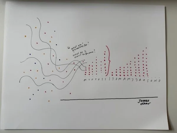
Lupi’s designs often start at sketches (above) before they become the final version (below).
You work with major organizations across industries. What do clients usually come to you asking for?
GL: People don’t usually come to us asking for traditional dashboards. They’ve often seen that data can live beyond reports through installations, physical or digital experiences, interactive systems, and even fashion collections made of data. Sometimes it’s a website marking an anniversary by visualizing a company’s history; other times it’s a brand identity where data influences how a logo or type system behaves. The conversations are often exploratory rather than transactional.
PC: That said, even traditional charts have room for innovation. Data visualization is becoming a real territory for brand expression. We’re moving beyond rigid standards toward more expressive systems that can still communicate complexity clearly. The goal isn’t just prettier charts; it’s more accessible and more effective ones.
Is there a dream project or organization you’d still love to work with?
PC: One of our true dream projects was actually with the Gates Foundation. It felt like the work could genuinely affect lives. With data visualization, you can make a real case for impact, especially when it’s tied to issues like global health or gender equality.
GL: For me, it’s transit maps, especially subway systems in big cities. They’re hidden infrastructures that shape daily life. Redesigning or rethinking a transit map would be a dream, because it’s not just functional — it’s cultural.

Join more than 75 leaders from top organizations, including Spotify, Amazon, Shake Shack, Stripe, NASA, Cannondale, Hearst, Roblox, Clay, Paramount, and Mailchimp.