Cocktails and Collage: Where Hands-On Design Beats Digital

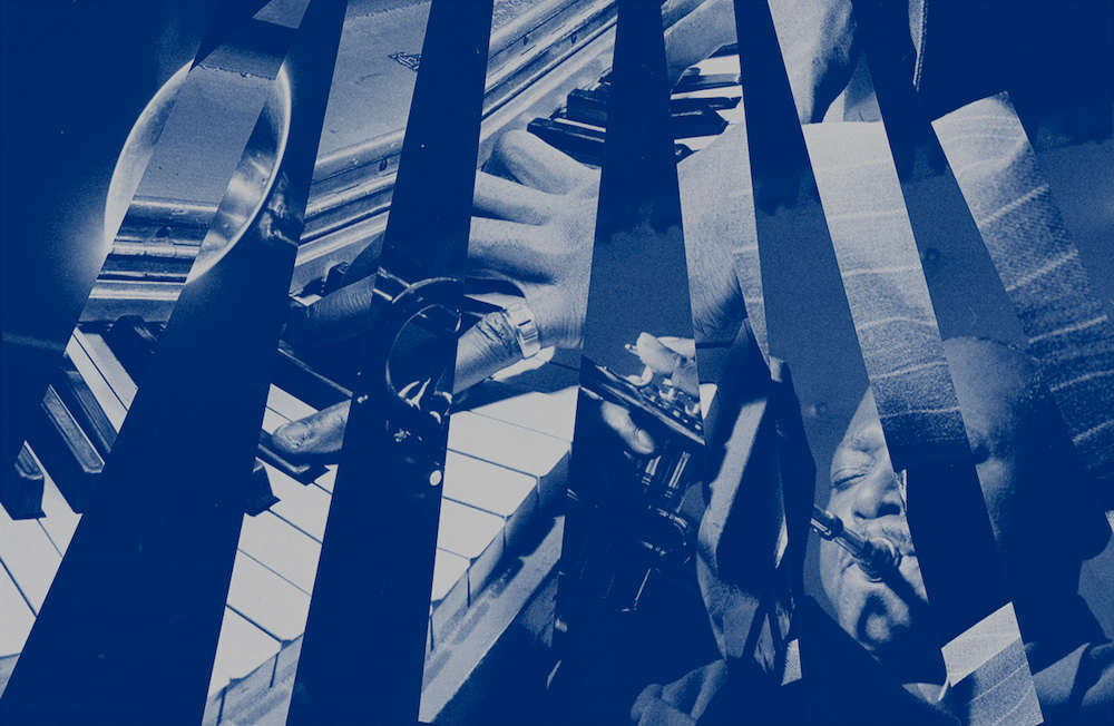
Stephanie Zabala and Team took a hands-on approach to design the Blue Note’s new signature cocktail label. Images c/o Team.
How do you visualize what jazz sounds like? That was the big question for three New Yorkers from Team, a design studio in Brooklyn.
The project was to create a custom bottle label for a new signature cocktail by Wandering Barman and the legendary Blue Note Jazz club. For Stephanie Zabala, Associate Design Director at Team, the query led her and her team to dig into Blue Note’s rich archival photography and learn about the club’s storied history.
Zabala and her team landed on a collage design — a surrealism-inspired art technique that gathers seemingly different elements to ultimately create one holistic image, similar to jazz. She describes the result as an “ensemble” of abstract labels that best represents the artistry, craft, and culture found inside the intimate Blue Note.
To hone in on the art of jazz, the labels purposefully don’t show any faces. “Our idea was to keep it pretty abstract and look for little moments in the photos: in one design we highlighted a pinky reaching for a piano key and fingers on strings in a really beautiful arrangement,” says Zabala. “Those details are emotional to me and they tell a story.”
Here, Zabala shares why a hands-on approach was better than a digital one, her definition of a unique design, and the decision to listen to Miles Davis during the team’s ideation sessions.

Team’s label artwork on Wandering Barman x Blue Note cocktail bottles.
How did you research the Blue Note’s archival photography and its prestigious history?
When we heard we were designing the cocktail bottle labels for Blue Note, we were super excited because we’re a team of New Yorkers. We also have a few musicians on the team, so internally, it was nice to do some research with musicians, as well as dive into Blue Note’s history and archives. The most exciting part was getting access to that Blue Note archival photography and seeing images from across the years of iconic performers on the stage. The imagery was wonderful and lively. It was inspiring to see who’s been on the stage and that became a huge part of the direction: integrating a mix of Blue Note archival photography and also images from the Library of Congress archives, which opened the door to the design concepts.
Tell me about the process of hand cutting Blue Note’s archival images for the collage design. How does surrealism come into play?
At Team we do a lot of digital design work, and to step away from that and actually use our hands to create these initial concepts was unique. Collage is inherently a surrealist concept or design tool. When we were having our ideation sessions and thinking about how jazz could be visualized, we noticed some natural ties with collage, where the artist gathers different elements that may be loosely related and creates a more holistic picture that really works — like has harmony to it. And that felt a lot like creating a piece of music.

What could you and your team do differently using your hands rather than a computer?
By using our hands, we figured out what images work well together and what creates both the right visual composition and emotional response. Our design intern Jerelin gravitated toward using their hands because they love collage. They started out with a rough and loose experimentation process, printing out a bunch of archival photography and creating different compositions without being too precious about it.
We were also doing a lot of other experiments in thinking about how we could create a sense of distortion or warping to achieve unique effects. We ended up taking pictures of the archival photography through glasses of water. All of this experimentation has inspired me to do more immersive concept ideation sessions in the future, and also push myself to step away from the computer when I can.
Just curious, did you listen to jazz to get into the mood while designing these labels?
During our conceptual phase, I worked with Jerelin and our designer Mark in a tiny conference room to research major jazz albums and influences of that time. We started by playing Kind of Blue by Miles Davis in the background, which felt like a nice start to an immersive ideation session — having the actual sound in the room and then researching questions like, “What actually is a blue note?” It's a note that strays from the norm or the standard scale. It's a little bit of an oddball. These are my words, not a jazz definition. So being in a room together, listening to jazz, looking at old photography, and defining all of these unique phrases gave us ideas about how the music could be visualized.

How does the collage serve as a nod to the musical concept of a blue note?
Well, when you think of a piece of music, and jazz in particular, it has this ability to be super improvisational and unexpected, and it can be very in-the-moment. And a blue note strays from the standard and does something unexpected. So we knew that there was room for the design to feel a little bit more experimental or unexpected because jazz has that inherent ability to create harmony out of so many different elements. That’s why we chose collage — you have to sit with it and it’s more like an experience. You can decode it however you want to decode it. And all of that felt really jazzy.
What makes a design unique?
A unique design to me is something that just feels right when you see it. That sounds straightforward, but it’s actually hard to do. It’s a difficult balance of making design decisions that are rooted in a concept and represent something, but also using your intuition to make sure something feels right within the context. Team prioritizes balancing these two approaches when creating design solutions — always starting with strategic and conceptual thinking, then translating that to a more visual, emotional world.
What was a highlight of the project?
Learning about a new subject is one of the coolest things about the design world, because with each project you have a learning opportunity, which in this case was jazz. My brother is a jazz musician, but we don’t talk about the details often. With this project, I felt lucky to learn about another art form that my family has a connection to. I loved seeing the many different forms and expressions jazz can take, which was a good reminder to approach creative ideation with a mindset of experimentation and openness.
If you’d like to read more from Creative Factor, subscribe to our newsletter. Or looking to tell your brand story? Introducing Creative Factor’s Brand Storytelling Studio.
Plus, more great reads, right this way…